American Watercolor · Watercolor
Painting California: The Colors That Actually Work
Watercolor artist Shuang Li shares her plein air palette for painting the ocean and desert in Southern California.
By Kelly Kane · November 1, 2026
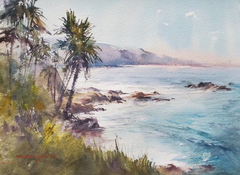
Each week for five weeks, we’re sharing the regional palette wisdom of one accomplished watercolorist, drawn from a feature in PleinAir Magazine. If you’re just joining us, you can find earlier installments here. This week, we head to the West.
Ocean and Desert in Southern California
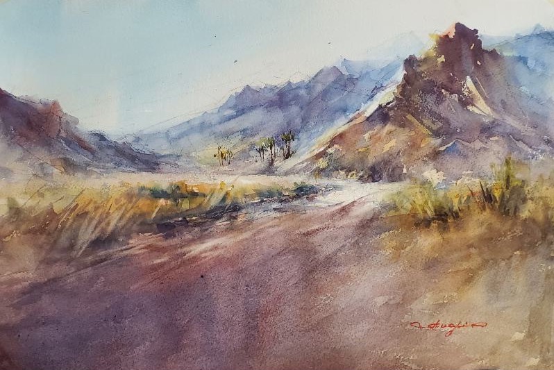
Southern California presents a painter with a rare and demanding challenge: two completely different landscapes within easy driving distance of each other, each requiring its own palette, its own sensibility, its own way of seeing. To the west, the Pacific Ocean — cool, blue, luminous. To the east, the desert — warm, reddish-brown, intense. Shuang Li paints both, and has built two distinct color palettes to do it.
“I prefer to work with limited sets of primary colors,” she says, “choosing specific combinations of reds, yellows, and blues that best suit the character and temperature of the landscape. I also utilize the reflective white of the watercolor paper to achieve the ‘right’ light.”
For coastal scenes, her foundation is a quartet of blues: Ultramarine Blue, Phthalo Blue, Cobalt Blue, and Cobalt Turquoise. Each plays a specific role. Ultramarine and Phthalo are both transparent, offering depth and luminous color intensity. Cobalt Blue, semi-transparent, expands the range of available blue shades. Cobalt Turquoise, opaque, adds covering power and a particular quality of light that the others can’t replicate. “By adjusting the water ratio of these mixtures, the results are almost endless,” she says, “covering every nuance needed for a coastal scene.”
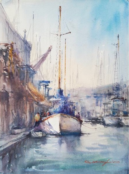
Of the four, Phthalo Blue may be the most surprising — and the most consequential. Many watercolorists deliberately avoid it, put off by its intensity and reputation for being difficult to control. But Li has used it for years and considers it indispensable. “I love its extreme transparency and intense tinting strength — a little goes a long way,” she says. Mixed with Cobalt Turquoise, it captures the transparent quality of backlit waves or deep coastal water. Straight from the tube with plenty of water, it creates what she describes as “a beautiful, highly transparent, intense sunny blue sky” — the particular brightness of California light — without tipping a painting into muddiness.
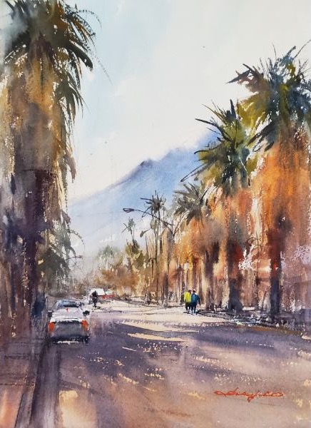
For desert and inland scenes, she works from an equally considered set of warm pigments: Brown Madder, Cadmium Scarlet, Rose Madder, New Gamboge, and Yellow Ochre. Again, the specific technical properties of each pigment matter as much as the color itself. Brown Madder and Rose Madder offer high transparency; Cadmium Scarlet and Yellow Ochre provide opacity for depth; and New Gamboge sits between them, semi-transparent, to adjust opacity and enhance warmth as needed. “When mixed thoughtfully,” she says, “these pigments create a range of warm shades with the covering power and depth essential for describing the desert landscape.”
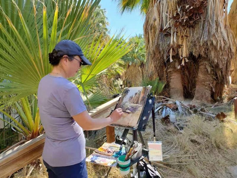
Among them, one color has proven especially indispensable. Brown Madder perfectly captures the bright, sun-soaked look of palm fronds in direct sunlight. And when combined with Yellow Ochre and Rose Madder, it replicates the dry, sandy texture of desert roads.
Taken together, her two palettes — one cool, one warm — cover virtually every landscape Southern California has to offer. To fill in the gaps, her standard outdoor palette also includes Cadmium Yellow Lemon, Burnt Umber, and Ivory Black, along with a selection of additional colors as needed. She works primarily with Da Vinci Paints, noting that Winsor & Newton and Daniel Smith offer comparable alternatives, though color names may differ.